class: center, middle  <!-- Do not forget to adapt the presentation title in the header! --> <!-- Adjust the presentation to the session. Focus on the challenges, this is not a coding tutorial. Note, to include figures, store the image in the `/docs/assets/images` folder and use the jekyll base.url reference as done in this template or see https://jekyllrb.com/docs/liquid/tags/#links. using the scale attribute , you can adjust the image size. --> <!-- Adjust the day, month --> # 26 NOVEMBER 2019 ## INBO coding club <!-- Adjust the room number and name --> Herman Teirlinck<br> 01.16 - Rik Wouters --- class: center, left <br>  --- class: center, middle <!-- Create a new badge using Inkscape based on the assets/images/coding_club_badges.svg file -->  --- class: center, middle ## What I have done? <br> [Coding club slides](https://inbo.github.io/coding-club/sessions/20191022/20191022_codingclub.html) --- class: center, middle 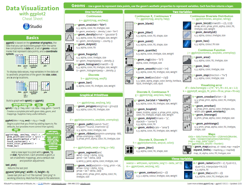 [Download cheatsheet here](https://github.com/inbo/coding-club/blob/master/cheat_sheets/20180522_cheat_sheet_ggplot2.pdf) --- class: center, middle ### How to get started? Check the [Each session setup](https://inbo.github.io/coding-club/gettingstarted.html#each-session-setup) to get started. ### First time coding club? Check the [First time setup](https://inbo.github.io/coding-club/gettingstarted.html#first-time-setup) section to setup. --- class: center, middle  --- class: center, middle ### Share your code during the coding session! <!-- Create a new hackmd file and replace this link (twice!) --> Go to https://hackmd.io/A0GZbxv2ToqjAvjT4XxKCQ?both <iframe src="https://hackmd.io/A0GZbxv2ToqjAvjT4XxKCQ?both" height="400px" width="800px"></iframe> --- class: left, middle ### Install the package suite Run `install.packages("tidyverse")` ### Load the package suite Run `library(tidyverse)` --- class: left, middle # The ggplot recipe: data - mapping - geometry 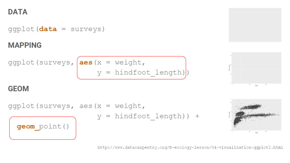 --- background-image: url(/assets/images/background_challenge_1.png) class: left, middle # Challenge 1 - Click [`20180222/20180222_surveys.csv`](https://github.com/inbo/coding-club/blob/master/data/20180222/20180222_surveys.csv) and download* data file to `/data` folder. - Click [`20191126/20191126_challenges.R`](https://github.com/inbo/coding-club/blob/master/src/20191126/20191126_challenges.R) and download* script file in `/src` folder. <p> After reading data.frame `survey`: - Plot `hindfoot_length` as function of `weight` using points - Plot `weight` as function of `species` using boxplot - Replace the previous boxplot with a violin plot - How many surveys per `sex`? Show it as a bar plot - How many surveys per `year`? Show it as bar plot <br> 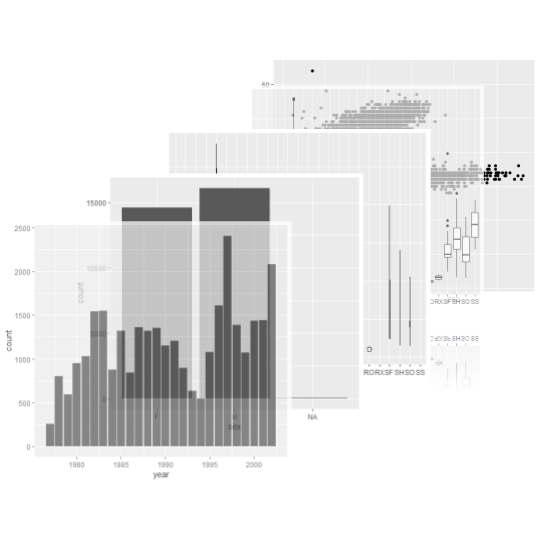 <small>* __Note__: check the getting started instructions on [how to download a single file](https://inbo.github.io/coding-club/gettingstarted.html#each-session-setup)</small> --- background-image: url(/assets/images/background_challenge_2.png) class: left, middle # Challenge 2 Apply the next changes to the first basic plot in `20191126/20191126_challenges.R` (`## challenge 2`): - Use `sex` as color - Adjust the transparency (alpha) of the points to 0.5 - Change the y label to "hindfoot length" - Add a title to the graph, e.g. "hindfoot length vs weight" - Use a logarithmic scale for the x-axis - Set points' colors to "red" for females and "yellow" for males Apply the next changes to the second basic plot: - Split bars into `sex` - Arrange bars for `F` and `M` side by side - Adjust the transparency of the bar to 0.5 - Change the y label to "number of surveys" - Add a title to the graph, e.g. "Number of surveys per year" - Flip x and y-axis --- class: left, middle ## Intermezzo: How to make subplots, one per each `sex` value? One line of code is sufficient... --- class: left, middle background-image: url(/assets/images/background_challenge_3.png) # Challenge 3 Download file [`20191126/20191126_BXL_iNaturalist_top20.csv`](https://github.com/inbo/coding-club/blob/master/data/20191126/20191126_BXL_iNaturalist_top20.csv). It contains the research grade observations of the top 20 most occurring species in and around Brussels as published by iNaturalist from 2000 up to now. Based on previous challenges and intermezzo, the cheatsheet, online documentation, etc., plot the number of observations per species and year. Try to show the results as best as possible and make the plot of your dreams, outdo yourself! Do not forget to paste your code with your name (or pseudonym...) in the hackmd. At the end of the coding club, we vote for the best plot! --- class: left, middle # Tutorials online There is a lot of documentation and tutorials online: 1. [Datacarpentry's data visualiation tutorial](https://datacarpentry.org/R-ecology-lesson/04-visualization-ggplot2.html) 2. [Stanford University tutorial](https://cengel.github.io/R-data-viz/data-visualization-with-ggplot2.html): chapter 1 3. [R Graphics Cookbook, 2nd edition](https://r-graphics.org/): comprehensive 4. Selva Prabhakaran's [r-statistics.co](http://r-statistics.co/ggplot2-Tutorial-With-R.html): extensive tutorials (Tutorial 1,2,3). Tutorials on modelling and timeseries too. 5. ... --- class: left, middle # Boost your graphs The [ggplot2's ecology](https://www.ggplot2-exts.org/gallery/): 60 packages extending ggplot functionalities!  --- class: center, middle  <!-- Adjust the room and date --> Room: Herman Teirlinck - 01.71 - Frans Breziers<br> Date: __19/12/2019__, van 10:00 tot 12:00<br> Title: Graphs 2.0 (boost your graphs)<br> (registration announced via DG_useR@inbo.be)