class: center, middle  <!-- Do not forget to adapt the presentation title in the header! --> <!-- Adjust the presentation to the session. Focus on the challenges, this is not a coding tutorial. Note, to include figures, store the image in the `/docs/assets/images/yyyymmdd/` folder and use the jekyll base.url reference as done in this template or see https://jekyllrb.com/docs/liquid/tags/#links. using the scale attribute , you can adjust the image size. --> <!-- Adjust the day, month --> # 17 DECEMBER 2020 ## INBO coding club <!-- Adjust the room number and name --> Exclusively on INBOflix --- class: center, middle <!-- Create a new badge using Inkscape or other programs based on the assets/images/coding_club_badges.svg file -->  --- class: left, middle ## Recap: what did I learn during the last coding club? The ggplot recipe: <strong>data - mapping - geometry</strong> 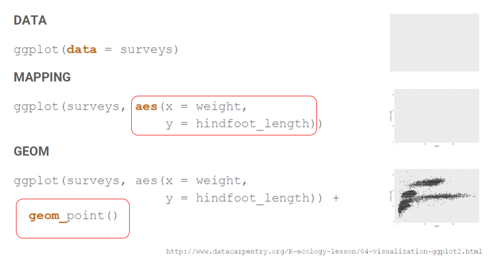 --- class: left, middle ## Recap: what did I learn during the last coding club? 1. Mapping can be defined in the geometry 2. The most important mapping argument? **aes**thetics! 3. Put all arguments which require variables (= columns) in `aes()`, all other arguments outside in the geometry Example: ```r # Color depends on Treatment, shape on Type ggplot(CO2) + geom_point(aes(x = conc, y = uptake, color = Treatment, shape = Type)) # All points are black and hollow ggplot(CO2) + geom_point(aes(x = conc, y = uptake), color = "black", shape = 1) ``` --- class: center, middle 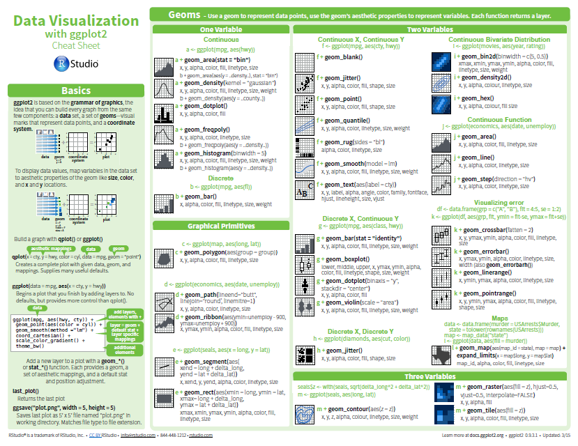 [Download cheatsheet here](https://github.com/inbo/coding-club/blob/master/cheat_sheets/20180522_cheat_sheet_ggplot2.pdf) --- class: center, middle ### How to get started? Check the [Each session setup](https://inbo.github.io/coding-club/gettingstarted.html#each-session-setup) to get started. ### First time coding club? Check the [First time setup](https://inbo.github.io/coding-club/gettingstarted.html#first-time-setup) section to setup. --- class: left, middle 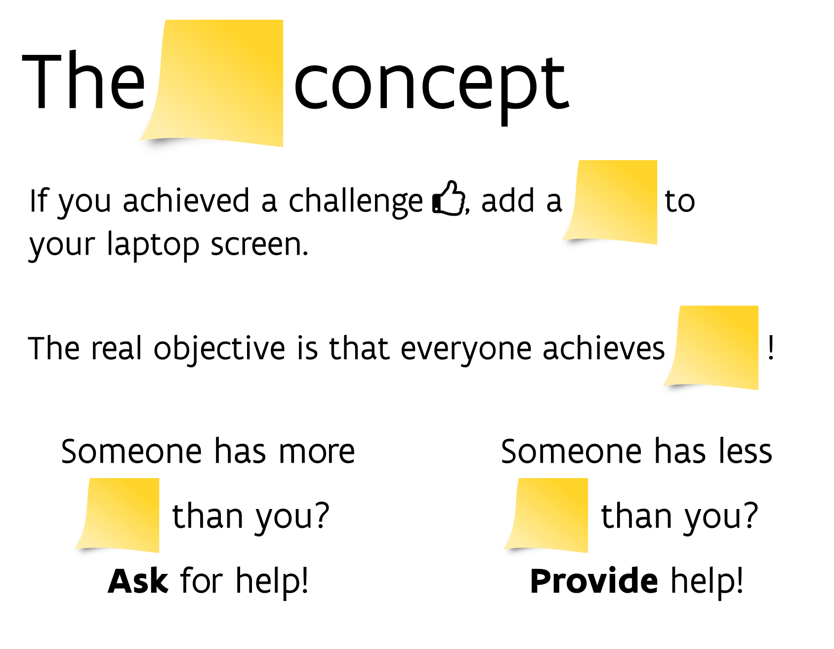 <br> No yellow sticky notes online :-( We use hackmd (see next slide) but basic principle doesn't change. --- class: center, middle ### Share your code during the coding session! <!-- Create a new hackmd file and replace this link (twice!) --> Go to https://hackmd.io/SEuVG7pURQmvUGVjeXOrLA?edit <iframe src="https://hackmd.io/SEuVG7pURQmvUGVjeXOrLA?edit" height="400px" width="800px"></iframe> --- class: left, middle ## Load the required packages ``` library(tidyverse) library(viridis) library(plotly) library(gganimate) library(patchwork) # for bonus challenge 1 library(RcolorBrewer) # for bonus challenge 2 ``` --- class: left, middle # Download data and code Instead of downloading the files manually we have a new `inborutils` function called `setup_codingclub_session()`. If you have not used this function yet, restart your R session and update the `inborutils` package by running: ```r if (!"remotes" %in% rownames(installed.packages())) { install.packages("remotes") } remotes::install_github("inbo/inborutils") ``` To download the coding club material of today, just run `setup_codingclub_session()`. In general, you can use the date in "YYYYMMDD" format , e.g. `setup_codingclub_session("20201027")`, to download the coding club material of October, 27. For all options, check the [tutorial online](https://inbo.github.io/tutorials/tutorials/r_setup_codingclub_session/). Of course, you can still download [data](https://github.com/inbo/coding-club/blob/master/data/20201217/) and [scripts](https://github.com/inbo/coding-club/blob/master/src/20201217/) manually*! <small>* __Note__: check the getting started instructions on [how to download a single file](https://inbo.github.io/coding-club/gettingstarted.html#each-session-setup)</small> --- class: left, middle # useR cases Today we will basically work on two useR cases (`usercase1`, `usercase2`). Run introductory section in R script to create them. You should end up with two plots as shown below (left: `usercase1`, right: `usercase2`).  --- background-image: url(/assets/images/background_challenge_1.png) class: left, middle # Challenge 1. Color palettes 1. A palette is nothing more than a character vector of colors. Create your own 4-color palette with [color picker](http://tristen.ca/hcl-picker/). Example: https://tristen.ca/hcl-picker/#/clh/4/1/3F2119/EEBEA2. 2. How to apply it to `usercase1`? 3. How to apply it to `usercase2`? --- class: left, middle ## Intermezzo. The prerequisites of a color palette A color palette should be: 1. printer-friendly (gray scale) 2. perceptually uniform 3. easy to read by those with colorblindness. All of this can be found in the [viridis palette](https://www.r-bloggers.com/2018/07/ggplot2-welcome-viridis/) which avoids the red and goes from blue to yellow passing through green (viridis: _green_ in Latin). And do you know you can simulate several cases of colorblindness (protanopia, deuteranopia, and tritanopia) by using `dichromat` package? More on this [viridis blogpost](https://www.r-bloggers.com/2018/07/ggplot2-welcome-viridis/). Another great tool for simulating color blindness is the [`colorblindr` R package](https://www.datanovia.com/en/blog/how-to-stimulate-colorblindness-vision-in-r-figures/). --- background-image: url(/assets/images/background_challenge_2.png) class: left, middle # Challenge 2 `ggplot2` includes some functions to use viridis palette directly. 1. How to apply viridis **discrete** color scale to `usercase1`? 2. How to apply viridis **continuous** color scale to `usercase2`? 3. Invert the color direction. Note: typically inverted color directions are less intuitive 4. Use colormap `"cividis"` instead of default (`"viridis"`) --- background-image: url(/assets/images/background_challenge_3.png) class: left, middle # Challenge 3A. Interactive plots 1. Make interactive plots of `usercase1` and `usercase2` using `plotly` package. Tip: follow this nice [plotly tutorial](https://www.musgraveanalytics.com/blog/2018/8/24/how-to-make-ggplot2-charts-interactive-with-plotly) 2. How to personalize the text displayed while hovering on the tiles of `usercase2`? Tip: same tutorial mentioned above or google it.  --- class: left, middle # Challenge 3B. Animated plots By making an animation plot you can see the evolution of the average covered area over time from 2000 to 2018. See example below created by using the [gganimate](https://gganimate.com/articles/gganimate.html) package. Some guidelines: 1. Make a basic animation plot and set year in the title 2. Use `animate()` to render the animated graphic and use sensible settings for `nframes` and `fps` parameters 3. Save the animation as gif and set width - height to 800-550 pixels 4. If you hate gifs you can save the animation as a mp4 video ([ffmpeg executable](https://www.wikihow.com/Install-FFmpeg-on-Windows) needed)  --- class: left, middle # Bonus challenge 1 1. Use the `patchwork` package to arrange usercase1 and usercase3 side by side, and above usercase2 2. Improve the patchwork by collecting all legends to the right (and in one go also remove duplicated legends) --- class: left, middle # Bonus challenge 2 ggplot functions `scale_color_brewer()` and `scale_fill_brewer()` allow you to use the brewer color palettes, which are also very nice and satisfy the criteria mentioned above. 1. Which _type_ should you use for better distinguishing different biotopes of `usercase1`? How to specify a specific palette instead of the default one? Tip: take a look at the blogpost [*The a-z of RcolorBrewer palette*](https://www.datanovia.com/en/blog/the-a-z-of-rcolorbrewer-palette/#display-all-brewer-palettes) 2. You could think that `scale_fill_brewer()` would allow you to do the same for `usercase2`. But you get this error below. How to solve it? Tip: load `RColorBrewer` pacakge and take a look at the blogpost mentioned above.  --- class: left, middle # Bonus challenge 3 It's almost Christmas. Let's celebrate it with a gift: the [data visualization checklist](https://stephanieevergreen.com/data-visualization-checklist/) of Stephanie Evergreen! Do your plots pass all these tests? ;-) --- class: left, middle ## Resources - Commented solutions will be available soon - `ggplot2` website: https://ggplot2.tidyverse.org/ - [`ggplot2` extension packages gallery](https://exts.ggplot2.tidyverse.org/gallery/) - [intuitive arranging of multiple plots with the patchwork package](https://patchwork.data-imaginist.com/) - THE BOOK: [Fundamentals of Data Visualization](https://clauswilke.com/dataviz/) - Talk about [color theory and the viridis palette](https://www.youtube.com/watch?v=xAoljeRJ3lU) at SciPy 2015 - Blogpost about colorblindness and how taking care of it in your plots: https://www.datanovia.com/en/blog/how-to-stimulate-colorblindness-vision-in-r-figures - Handy tutorial with some tricks about colors in ggplot2: https://www.datanovia.com/en/blog/ggplot-colors-best-tricks-you-will-love/ - Rate your visualization using Stephanie Evergreen's [data visualizaion checklist](https://stephanieevergreen.com/data-visualization-checklist/) - Tutorial about using [plotly package](https://www.musgraveanalytics.com/blog/2018/8/24/how-to-make-ggplot2-charts-interactive-with-plotly) for making interactive plots - [gganimate online documentation](https://gganimate.com/articles/gganimate.html) to *animate* your plots --- class: center, middle # Questionnaire It is never too late for filling out the (very short) [INBO coding club questionnaire](https://forms.gle/gy9LV2KrBfYaLbMLA).  --- class: left, middle ```r > library(cowsay) > cowsay::say(what = "Merry Christmas and Happy New Year!", by = "egret") ----- Merry Christmas and Happy New Year! ------ \ \ \ \ _, -==<' ` ) / / (_. | ,-,`\ \\ \ \ `\, \ \ ||\ \`|, jgs _|| `=`-' ~~`~` ``` --- class: center, middle  <!-- Adjust the room and date --> Room: 01.05 - Isala Van Diest(?)<br> Date: __26/01/2021__, van 10:00 tot 12:00<br> Subject: `inbodb`: INBO databases in R <br> (registration announced via DG_useR@inbo.be)