class: center, middle  <!-- Do not forget to adapt the presentation title in the header! --> <!-- Adjust the presentation to the session. Focus on the challenges, this is not a coding tutorial. Note, to include figures, store the image in the `/docs/assets/images/yyyymmdd/` folder and use the jekyll base.url reference as done in this template or see https://jekyllrb.com/docs/liquid/tags/#links. using the scale attribute , you can adjust the image size. --> <!-- Adjust the day, month --> # 31 AUGUST 2021 ## INBO coding club <!-- Adjust the room number and name --> Exclusively on INBOflix --- class: center, middle <!-- Create a new badge using Inkscape or other programs based on the assets/images/coding_club_badges.svg file -->  --- class: center, middle  <br> [ggplot2](https://ggplot2.tidyverse.org/) --- class: center, middle 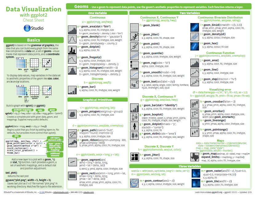 [Download cheatsheet here](https://github.com/inbo/coding-club/blob/master/cheat_sheets/20180522_cheat_sheet_ggplot2.pdf) --- class: center, top ### How to get started? Check the [Each session setup](https://inbo.github.io/coding-club/gettingstarted.html#each-session-setup) to get started. ### First time coding club? Check the [First time setup](https://inbo.github.io/coding-club/gettingstarted.html#first-time-setup) section to setup. --- class: left, top ## Coding club play tables **Like** a card club, we will split us in different tables (aka _breakout rooms_) and we will help each other! We return all together after a fixed amount of time to discuss each challenge apart. **Unlike** a card club, in our club there is no winner, neither within a table nor among tables!  --- class: center, middle # Share your code during the coding session <!-- Create a new hackmd file and replace this link (twice!) --> Go to https://hackmd.io/T9b0ChbyTj2C0zjMm99Wog?both and start by adding your name in section "Participants". <iframe src="https://hackmd.io/T9b0ChbyTj2C0zjMm99Wog?edit" height="400px" width="800px"></iframe> --- class: left, top # Download data and code No datasets or code to download today! We will work with R preloaded datasets! --- class: left, middle # ggplot recipe: data - mapping - geometry  --- background-image: url(/assets/images/background_challenge_1.png) class: left, middle # Challenge 1 Give a look at the [`ToothGrowth` dataset](https://www.rdocumentation.org/packages/datasets/versions/3.6.2/topics/ToothGrowth) 1. Plot length of odontoblasts (`len`) as function of the supplement (`supp`) using points 2. Plot length of odontoblasts (`len`) as function of the dose (`dose`) using points 3. Starting from 2, distinguish `supp` using points with different colors and different shapes 4. Starting from 3, change the y-axis label to "length (mm)", change the x-axis label to "dose (mg/day)", change the legend title to "supplement" and add a title to the graph, e.g. "The Effect of Vitamin C on Tooth Growth in Guinea Pigs" 5. Starting from 4 (or 3 if 4 not solved), set colors to "blue" for orange juice supplemnet ("OJ") and "indian red" for vitamine C ("VC") --- class: left, middle ## Intermezzo. Aesthetics This works: ``` ggplot(ToothGrowth, aes(x = dose, y = len, color = supp)) + geom_violin() ``` This works too: ``` ggplot(ToothGrowth) + geom_violin(aes(x = dose, y = len, color = supp)) ``` What should I use? Both are good, but... But what if you want to plot two or more geometries with *different* aesthetics? --- background-image: url(/assets/images/background_challenge_2.png) class: left, middle # Challenge 2A 1. What’s gone wrong with this code? Why are the points not blue and transparency not correct? How to solve it? ``` ggplot(ToothGrowth, aes(x = dose, y = len, color = "blue", alpha = 0.3)) + geom_point() ``` 2. With so many points it is hard to see the effect of `supp` and `dose` on `len`. A box plot ( `geom_boxplot()`) could help, but what's gone wrong with this code? The x , `dose`, doesn't make any sense. How to solve it? Hint: look at the examples in the help file of `?geom_boxplot`. ``` ggplot(ToothGrowth, aes(x = dose, y = len, color = supp, group = supp)) + geom_boxplot() ``` --- background-image: url(/assets/images/background_challenge_2.png) class: left, middle # Challenge 2B Let's work with dataset `Orange` containing data about the growth of some orange trees. The point plot on the left is difficult to understand. Smoother lines can help. Try to reproduce the right figure. Do not show the standard error for the smoothers at tree level and try to get the tree numbers in legend using an increasing order.  --- background-image: url(/assets/images/background_challenge_3.png) class: left, middle # Challenge 3A Sometimes using colors or shapes is not sufficient: you would like to split data in a grid of subplots. 1. How to plot the growth of each tree as separate subplots as shown in the figure below? 2. How to replace `1`, `2`, `3`, etc. above each subplot with `"Tree 1"`, `"Tree 2"`, `"Tree 3"`, etc.?  --- background-image: url(/assets/images/background_challenge_3.png) class: left, middle # Challenge 3B After transforming `HairEyeColor` to a data.frame: ``` hair_eye_color_df <- as.data.frame(HairEyeColor) ``` try to best show the difference of the distribution between males and females for each combinations of hair-eye color. Here below one possible way*.  <small>* __Note__: To get same color, run [`library(INBOtheme)`](https://inbo.github.io/INBOtheme/). --- class: left, middle # Bonus challenge Using `airquality` dataset, how to plot each air quality variables (`Ozone`, `Solar.R`, `Wind` and `Temp`) as function of the date (`month`- `day` combination) with a smoother on top of it as shown in the figure* below? Think about the best way to display the y-axis scale(s) of the subplots. Note that the code to combine `month` and `day` to a variable called `date` is already provided, see code below. Hint: `ggplot2` is probably not enough. Combine it with another `tidyverse` package.  <small>* __Note__: To get same color, run [`library(INBOtheme)`](https://inbo.github.io/INBOtheme/). --- class: left, middle ## Resources - `ggplot2` website: https://ggplot2.tidyverse.org/ - Commented solutions: [20210831_challenges_solutions.R](https://github.com/inbo/coding-club/blob/master/src/20210831/20210831_challenges_solutions.R) - [Video recording](https://vimeo.com/596087475) of this coding club edition is available on the [INBO vimeo channel](https://vimeo.com/inbo) - R for Data Science: [Chapter 3: Data visualization](https://r4ds.had.co.nz/data-visualisation.html) - [Datacarpentry's data visualiation tutorial](https://datacarpentry.org/R-ecology-lesson/04-visualization-ggplot2.html) - [Stanford University tutorial](https://cengel.github.io/R-data-viz/data-visualization-with-ggplot2.html): chapter 1 - R for Data Science: [Chapter 28: Graphics for communication](https://r4ds.had.co.nz/graphics-for-communication.html) --- class: center, middle  <!-- Adjust the room and date --> Room: [Herman Teirlinck](https://goo.gl/maps/cN4kHPtX4vKLCTAH7) - 01.05 - Isala Van Diest <br> Date: __30/09/2021__, van 10:00 tot 12:00<br> Subject: ggplot and more: how to make outstanding plots (registration announced via DG_useR@inbo.be)