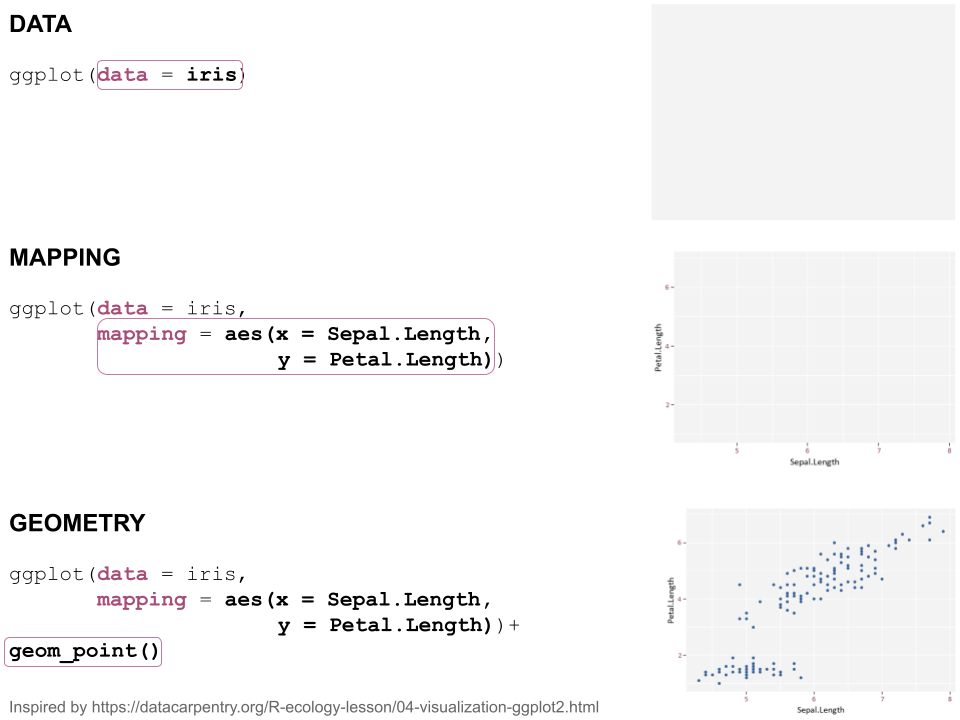
class: center, middle  <!-- Do not forget to adapt the presentation title in the header! --> <!-- Adjust the presentation to the session. Focus on the challenges, this is not a coding tutorial. Note, to include figures, store the image in the `/docs/assets/images/yyyymmdd/` folder and use the jekyll base.url reference as done in this template or see https://jekyllrb.com/docs/liquid/tags/#links. using the scale attribute , you can adjust the image size. --> <!-- Adjust the day, month --> # 29 SEPTEMBER 2022 ## INBO coding club <!-- Adjust the room number and name --> Herman Teirlinck Building 01.71 - Frans Breziers --- class: center, middle <!-- Create a new badge using Inkscape or other programs based on the assets/images/coding_club_badges.svg file -->  --- class: center, top  Download [cheatsheet](https://github.com/inbo/coding-club/blob/master/cheat_sheets/20220830_cheat_sheet_ggplot2.pdf) --- class: left, middle ### How to get started? Check the [Each session setup](https://inbo.github.io/coding-club/gettingstarted.html#each-session-setup) to get started. ### First time coding club? Check the [First time setup](https://inbo.github.io/coding-club/gettingstarted.html#first-time-setup) section to setup. --- class: left, top  --- class: center, top # Share your code during the coding session <!-- Create a new hackmd file and replace this link (twice!) --> Go to https://hackmd.io/QSoki6koSxqvvN8YPL5YeQ?edit and start by adding your name in section "Participants". <iframe src="https://hackmd.io/QSoki6koSxqvvN8YPL5YeQ?edit" height="400px" width="800px"></iframe> --- class: left, top # Download data and code You can download the material of today: - automatically via `inborutils::setup_codingclub_session()`* - manually** from GitHub folders [coding-club/data/20220929](https://github.com/inbo/coding-club/tree/master/data/20220929) and [coding-club/src/20220929](https://github.com/inbo/coding-club/tree/master/src/20220929) <br> <small> __\* Note__: you can use the date in "YYYYMMDD" format to download the coding club material of a specific day, e.g. run `setup_codingclub_session("20220428")` to download the coding club material of April, 28 2022. If date is omitted, i.e. `setup_codingclub_session()`, the date of today is used. For all options, check the [tutorial online](https://inbo.github.io/tutorials/tutorials/r_setup_codingclub_session/).</small> <br> <small> __\*\* Note__: check the getting started instructions on [how to download a single file](https://inbo.github.io/coding-club/gettingstarted.html#each-session-setup)</small> --- class: left, top # Load libraries ```r library(tidyverse) library(patchwork) library(viridis) ``` --- class: left, top # RECAP: ggplot recipe: data - mapping - geometry  --- class: left, top ## Recap: mapping Mapping can be defined in either `ggplot()` or the geometry `geom_*()`. ```r # mapping in ggplot() ggplot(ToothGrowth, mapping = aes(x = dose, y = len)) + geom_point() # mapping in geometry geom_point() ggplot(ToothGrowth) + geom_point(mapping = aes(x = dose, y = len)) ``` What to do with multiple plots (geometries)? ```r # set all args of aes() in each geom_*() ggplot(ToothGrowth) + geom_violin(mapping = aes(x = dose, y = len, group = dose)) + geom_point(mapping = aes(x = dose, y = len)) # put common args of aes() in ggplot() ggplot(ToothGrowth, mapping = aes(x = dose, y = len)) + geom_violin(mapping = aes(group = dose)) + geom_point() ``` --- class: left, top ## Recap: mapping - aesthetics The most important mapping argument? **aes()**thetics! Put all arguments which require variables (= columns) in `aes()`, leave all other arguments out. ```r # you want color represents the supplement (supp) ggplot(ToothGrowth, mapping = aes(x = dose, y = len)) + geom_point(aes(color = supp)) # you want all points are blue hollow triangles ggplot(ToothGrowth, mapping = aes(x = dose, y = len)) + geom_point(color = "blue", shape = 2) ``` --- background-image: url(/assets/images/background_challenge_1.png) class: left, top # Challenge 1: color palettes & scales Let's _scale_ colors!  --- background-image: url(/assets/images/background_challenge_1.png) class: left, top # Challenge 1: color palettes & scales 1. A palette is nothing more than a character vector of colors. Create your own 4-color palette with [color picker](http://tristen.ca/hcl-picker/). Example: http://tristen.ca/hcl-picker/#/hlc/4/1/7D414A/74C9EC 2. How to use it for `usecase1`? 3. How to use it for `usecase3`? 4. How to invert the color scale of `usecase3`? 5. How to use the official INBO palette (without changing all layout by loading the package!)? Check: [`INBOtheme::inbo_palette()`](https://inbo.github.io/INBOtheme/reference/inbo_palette.html) documentation. Install the package `INBOtheme` first, see [INBOtheme website](https://inbo.github.io/INBOtheme/#installation). --- class: left, top # Intermezzo. How to choose a color palette A color palette should be: 1. printer-friendly (gray scale) 2. perceptually uniform 3. easy to read by those with colorblindness. All of this can be found in the [viridis palette](https://www.r-bloggers.com/2018/07/ggplot2-welcome-viridis/) which avoids the red and to go from blue to yellow passing through green (_viridis_: green in Latin). --- class: left, top # Intermezzo. The _viridis_ color palette `ggplot2` includes some functions to use the viridis palette directly. Apply viridis discrete color scale (use case 1 and 2): ``` usecase1 + scale_color_viridis_d() # equivalent to my_viridis_palette <- viridis(4) usecase1 + scale_color_manual(values = my_viridis_palette) ``` --- class: left, top # Intermezzo. The _viridis_ color palette `ggplot2` includes some functions to use the viridis palette directly. Apply viridis continuous color scale (use case 3 and 4): ``` usecase3 + scale_fill_viridis_c() # equivalent to usecase3 + scale_fill_continuous(type = "viridis") # or usecase3 + scale_fill_gradientn(colours = my_viridis_palette) ``` Invert the color direction: ``` usecase3 + scale_fill_viridis_c(direction = -1) # equivalent to usecase3 + scale_fill_continuous(type = "viridis", direction = -1) # or usecase3 + scale_fill_gradientn(colours = rev(my_viridis_palette)) ``` --- background-image: url(/assets/images/background_challenge_2.png) class: left, top # Challenge 2. Combine separate ggplots Combining ggplots has never been so intuitive thanks to `patchwork` R package. Using the online package [documentation](https://patchwork.data-imaginist.com/index.html): 1. Display `usecase1` and `usecase2` next to each other 2. Display `usecase2` below `usecase1` 3. Display `usecase1` and `usecase2`in first row and `usecase3` and `usecase4` in the second row creating a 2x2 plot grid. Use lowercase roman numerals to enumerate the subplots. Hint: check pacthwork function `plot_annotation()` 4. `usecase1` and `usecase2` share the same legend. How to avoid duplicating it in 1 and 2? Check [guides controlling section](https://patchwork.data-imaginist.com/articles/guides/layout.html#controlling-guides) 5. What if you try to avoid duplicating the legend of `usecase3` and `usecase4`? Can you understand why? How to solve it? Hint: _scale_ your plots, check the ggplot cheatsheet! 6. Display `usecase3` on the left and a table with the displayed data (species, region, biotope, meanArea) on the right. Hint: check this [vignette](https://patchwork.data-imaginist.com/articles/guides/assembly.html#adding-non-ggplot-content) --- background-image: url(/assets/images/background_challenge_3.png) class: left, top # Challenge 3. Fine tune your ggplots 1. By making heatmaps as `usecase3`, ggplot adds some space all around the colored area. How to fill the entire plot space? 2. Remove the title and the legend of `usecase3` 3. Set legend of `usecase4` below the heatmap. The title of the legend, "Area (%)", is set too low in comparison with the colorbar, right? How to align it with the colorbar? How to customize the legend background and border by using light grey as background color and blue as border color? 4. Starting from 3, how to set a space of 0.5cm between plotting area and legend box? --- class: left, top # Resources - [Challenges solutions](https://github.com/inbo/coding-club/blob/master/src/20220929/20220929_challenges_solutions.R) - `ggplot2` website: https://ggplot2.tidyverse.org/ - the official [R Graphics Cookbook](https://r-graphics.org) - another interesting book: [Fundamentals of Data Visualization](https://clauswilke.com/dataviz/) - [`ggplot2` extension packages gallery](https://exts.ggplot2.tidyverse.org/gallery/) - arrange intuitively multiple plots with the [patchwork](https://patchwork.data-imaginist.com/) package - talk about [color theory and the viridis palette](https://www.youtube.com/watch?v=xAoljeRJ3lU) at SciPy 2015 - blogpost about colorblindness and how taking care of it in your plots: https://www.datanovia.com/en/blog/how-to-stimulate-colorblindness-vision-in-r-figures - [ggsci](https://nanx.me/ggsci/index.html) package offers a collection of high-quality ggplot compatible color palettes - handy tutorial with some tricks about colors in ggplot2: https://www.datanovia.com/en/blog/ggplot-colors-best-tricks-you-will-love/ - Rate your visualization using Stephanie Evergreen's [data visualizaion checklist](https://stephanieevergreen.com/data-visualization-checklist/) - Tutorial about using [plotly package](https://www.musgraveanalytics.com/blog/2018/8/24/how-to-make-ggplot2-charts-interactive-with-plotly) for making interactive plots - do you want to animate your plots? Check [challenge 3B](https://inbo.github.io/coding-club/sessions/20201217_outstanding_plots.html#16) of 17 Dec 2020 - do you want to make your plots interactive? Check [challenge 3B](https://inbo.github.io/coding-club/sessions/20210930_ggplot_advanced_and_beyond.html#15) of 30 Sept 2021 --- class: center, middle  <!-- Adjust the room and date --> Room: 06.C.03 & 07.C.03<br> Date: __6/10/2022__, van 10:00 tot 12:30<br> Subject: **Shiny for beginners** <br> (registration announced via DG_useR@inbo.be)